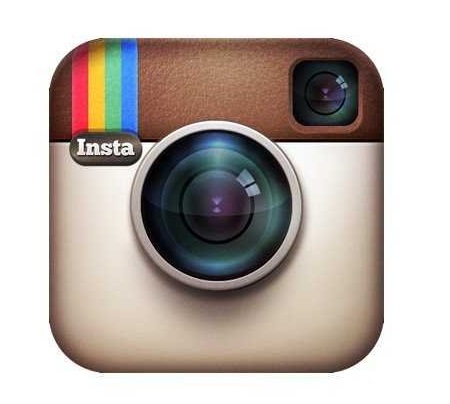
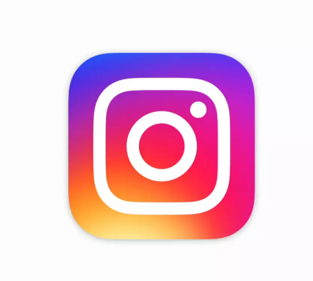
So, I woke up this morning to my Instagram app having a new logo, and I must say I am liking this warm and eye-catching new look, though, this fondness is strongly my opinion, as this change has revealed mixed reactions from users. And it’s not just Instagram that got a new look, also their other creative apps– Layout, Boomerang and Hyperlapse.
According to an Instagram post, they’ve made improvements to how the Instagram app looks like on the inside as well. The simpler design puts more focus on your photos and videos without changing how you navigate the app.
The new logo represents a simpler camera with the rainbow in a gradient form also the app was redesigned to make its menus and background entirely black and white.
So check it out and let me know which you prefer, this or the previous one.