By Oyin Braithwaite
The other day, I was talking to someone; gently explaining why their book cover was not achieving its most obvious objective – drawing in the potential reader.
His response to my eloquent yet non-critical feedback was a “You shouldn’t judge a book by its cover.”
I was stunned; speechless even, until I found myself, “Perhaps we shouldn’t but the truth is we do.”
However, it later occurred to me, the idiom ‘Don’t judge a book by its cover’ is an instruction not to pre-judge the value of something. It’s not supposed to be a carte blanche excuse for bland or tasteless book covers.
In this article, I intend to point out How To Judge A Book By Its Cover and hopefully the sceptics out there will understand why we do and why it is necessary that we do.
The Chick Lit
This is my favourite cover type to judge. I can tell a chick lit book from a mile away.
Title: The titles and often the name of the author tend to be big, bold and fanciful. Chick lit covers favour fonts that are italicized like French Script or Lucida Handwriting.
Chick lits also tend to have some tag line – ‘she thought she knew herself, until he showed her she didn’t’; ‘one man, two man, three men and her dog’
Colour Scheme: Chick lit covers tend to use pastel colours. They favour pinks, blues, greens and yellows; colours designed to give you a positive and happy feeling.
Images: There will usually be a woman on the cover, but not always.
Inside Pages: The font on the inside is usually an 11 or 12. Big enough so that the reader can digest the book with ease.
Blurb: The blurb will tell you about a woman in some complicated love situation (or worse, no love situation!) and invite you to find out about how she gets her happy ending (and rest assured it will be a happy ending, otherwise it’s not chick lit.)
Examples:
The Crime Novel
This spoiler also covers Thrillers and even some Horrors.
Title: The titles tend to be fairly simple to draw attention to the image. Also, keep in mind that if the title has ‘death’, ‘blood’, ‘torture’, ‘killer’, then there is an 99% chance you have selected a crime/thriller/horror novel.
Colour Scheme: These books are dark, navy blues, reds, greys. They are designed to look bleak, and promise you lots of tension and possibly gore. If you see splashes of blood, you will get the gore.
Images: There may be a lone figure, blood, a weapon – gun, knife, rope, an arm (signifying a dead person) and so on.
Inside Pages: The font on the inside is usually an 11 or 12. Big enough so that the reader can digest the book with ease.
Blurb: With crime novels, the blurb will tell you there has been a victim, maybe two; and the detective is trying to get the killer before time runs out or another victim turns up, or perhaps now the killer has decided the detective is far more interesting (something like that, you get the idea)
Examples:
The Fantasy Novel
This is my favourite novel to read and an easy genre to pick out from the masses.
Title: The titles are bold, but usually pretty simple. If you come across words such as ‘dragon’, ‘magic’, ‘sorcerer’, ‘witch’ then you are on the money that it is a fantasy.
Colour Scheme: It’s fantasy, so you can go wild with the colour, but the majority tend not to favour bright colours (unless it is for the consumption of children)
Images: If you see a dragon, a cloaked figure, someone with a sword or a bow and arrow…again…fantasy.
Inside Pages: The font on the inside is usually 10 or 12. Fantasy writers have a LOT to say and not a lot of room to say it. So expect small/medium print.
Blurb: Fantasy novels could be set in the past or present, could be about dragons and sword wielding men or a school for witches or a werewolf clan but the blurb will promise you adventure (and hopefully romance as well).
Examples:
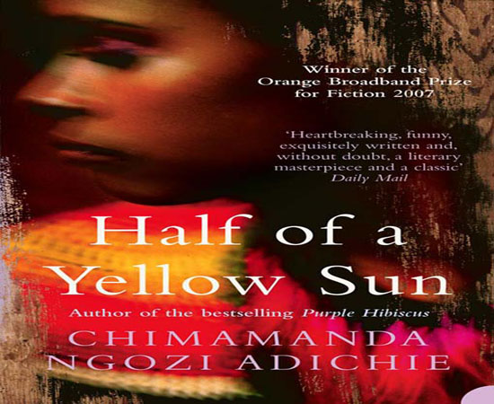
The African Literary Novel
I have had a limited experience with African literature but I believe I am beginning to see a pattern.
Title: The titles are bold but plain. The content – descriptive.
Colour Scheme: Browns, blacks and oranges (anyone noticing a similarity to skin colour?)
Images: The image will quickly indicate the foreignness’ of the book via black women wearing traditional attire or African art or scenery.
Inside Pages: The font on the inside is usually 10. Literary novels in general stay away from large font.
Blurb: The blurb will tell you about the suffering of a single individual or a group of individuals or a tribe. The overcoming of stereotypes, the breaking free or succumbing to the prisons of the mind or the shackles of your physical jailers.
Examples:
Also, if the name of the author is bigger than the title of the book, it is a good indicator that the author is popular and/or has written a bestseller.
Please note, nothing I have written is a hard and fast rule. You will find novels who operate outside of them.
 About the author: Oyin Braithwaite is a Writer and Editor Currently working at Ajapaworld as a Publishing Manager. Her educational background consists of an Undergraduate degree in Creative Writing and Law. She has also published various short stories in both Nigeria and the UK. You can read more of her work at Writinginwhispers.wordpress.com.


